11 June 2020

Design your Home Healthier


Since the last time that I posted, I have turned my little book, DESIGN your HOME HEALTHIER, from an ebook into a paperback. This allowed me to add lots of images to it and to revisit the text.

The project began quite a few years ago, when I found myself pondering whether the design changes you make to your home could possibly make any difference to your health. I wasn't thinking so much about psychological health but your real, measurable, physical health. And so I began to do research into whether there were links between design and health. I didn't know what the answer would be, but I actually found huge resources of fully accredited scientific research which pointed to a connection between design and health.

It was just left to me to shape everything I found into a book. I included all the most mind-blowing pieces of scientific evidence, and then used that as the basis for describing how you can go on to maximise the healthy potential of your own home. I have called my book DESIGN your HOME HEALTHIER.

If you'd like to read about what I found, you'll find my book here as the colour version, or here as the black-and-white version. I hope it gives food for thought.

18 January 2018

Even more blobs and globules

Soft, rounded blob shapes seem to have a captivating appeal. Take a peek at my earlier blogs: Blobs and Globules and More blobs and globules: Emotive simplicity. And, if you thought that no blob-type things could ever deserve to be described as 'art', then I beg you to check out the ones by Canadian artist Sharon Engelstein (in Blobs and Globules). Hers are giant green splodges, apparently crawling between the huge classical portico columns of a Baltimore museum. It is this sort of juxtaposition that shows that things don't ever have to be style matched; it is often the contrast that sharpens the perception and makes some fun.

If you're with me on this, I have found some more examples of all things blobby, some of them glowing gently and wistfully. I love the pair of glowing globes, floating on the pool, for being so simple and, at the same time, just slightly other-worldly. Apparently, they can glow in a selected hue matched to your whim or the weather, or just keep on changing.

The strange, shiny, tactile balls-in-hand are actually giant gel water beads. In water, they swell to a diameter of about 40mm.


1 Perfectly, insouciantly simple outdoor floating lights, from P K Green.
2 from Sevenmye 3 from P K Green


14 January 2016

Jelly beans for design: Sweet inspiration

Jelly bean sweets for design inspiration? Well, why not - I think they're utterly beguiling! Actually, it was my daughter who said I should do a blog about jelly beans: Looking at these wonderful blob-shaped pouffes, which surely must be some sort of relation of the scrumptious jelly bean, I'd say she wasn't wrong!

The endearing little pouffes are a design called Puppa, and are from amazing Swedish design company Bla Station, whose compelling furniture I featured in my previous blog More blobs and globules: Emotive simplicity. They are proof that jelly beans are all you need to inspire design.

The first image was from a search of Jelly Bean Walls - I'm sure you could design a Jelly Bean Wall. It's very pharmaceutical, very Damien Hirst. The other image is simply sculptural; at this scale it's an interior design in it's own right.

Boiled sweet colours and great taste - can we get enough of them?

 1 Image by Gareth Jones
3  Image by Ruth L.  Images 1 & 3 via Flickr under CC BY license.


08 January 2016

Beautiful bathrooms to love: The power of strong colour

These strikingly coloured bathrooms are a feast for the eyes in the depths of winter, and these are really beautiful. Persuasive strong colour is an almost physical tonic, and never more than with the weather here now turning chilly.

My recent blogs Interiors beyond minimalism: Designing the blues, ultimate cool, and More blobs and globules: Emotive simplicity  suggested that minimalism need be neither bland nor cold. These spaces are another case in point, the added ingredient here being the strongest colour.

Could these bathrooms inspire your own cosy retreat from these frozen mornings?


 All images by C_osett from Flickr under CC BY license.

05 January 2016

Charles Rennie Mackintosh: Modernism and light from another century

Charles Rennie Mackintosh found modernism from light and from the way he dealt with that light. He was the Glasgow architect who gained, if only after his death, something like folk-hero status in his native Scotland, in a way that no more than a handful of architects in the world have ever done. His delicately perfect drawings have made him a draughtsman's draughtsman, and his slightly austere exteriors epitomise Scottish buildings, but it is within those impenetrable walls that his real legacy is concealed. To venture inside a Mackintosh building is be met with brilliant light, often dazzling whiteness and the serendipity of  tiny beguiling details. The main surprise, though,  comes from  his shocking modernism and the sheer disbelief that such spaces could have been designed so long ago.

Born in Glasgow in 1868, Mackintosh was at his most prolific as the nineteenth century faded into the grasp of the twentieth century, although a great deal of his work was never realised in his lifetime.  The affection and reverence in which he is held is exemplified by the way his  House for an Art Lover design was finally completed in a Glasgow park in 1996, funded by a local charitable trust of the same name. Designed by Mackintosh in 1901 for a German competition (and disqualified on a technicality) it was built to follow his designs as nearly as possible.

It is well known  that  Mackintosh  was taken with Japanese design, and the connection to his work is easy to see. (See my blog about 
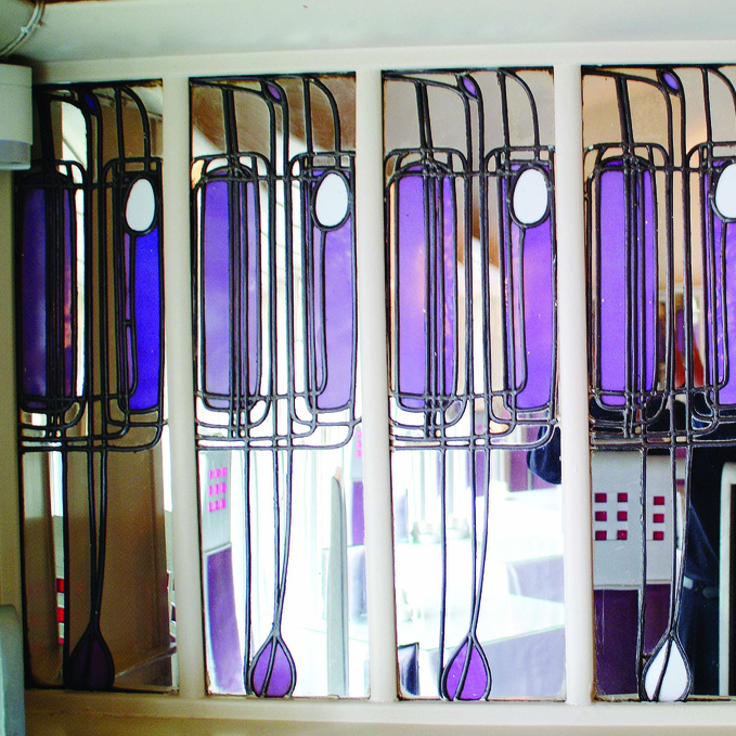
Japanese paper screens for Japanese rooms which could almost be Mackintosh's own work). Those screens and windows let the light into a world of dingy Victoriana, but then Mackintosh began to work with the light that those windows let in. He worked out that the lighter the walls then the lighter the room. He worked out that the lighter the ceiling and then the floor, carpeted outrageously in white, then the lighter still the space. His windows didn't just allow views, instead they selected and framed those views.  Tiny pieces of stained glass coloured the light as it fell, magically, onto dazzling walls. Tiny holes carved in posts and mullions made bright pinpricks of light and selected tiny views. I think Mackintosh had decoded light and had discovered modernism.

1 The Music Room, Charles Rennie Mackintosh's  House for an Art Lover, Glasgow. Image by Jean-Pierre Dalbera.  Detail from Charles Rennie Mackintosh's Willow Tea Rooms, Glasgow. Image by Brian Ledgard  3 Ceiling lights in the Dining Room,    House for an Art Lover, Glasgow. Image by Jean-Pierre Dalbera.  All images from Flickr under CC BY license.

17 December 2015

Interiors beyond minimalism: Designing the blues, ultimate cool

My blog earlier this month which focussed on a wondrous chair design, More blobs and globules: Emotive simplicity, was an exercise in demonstrating that minimalism does not have to be bland or cold. The shortcoming of the minimalist look, which seems to have come to dominate the acceptable approach of contemporary design, is that it is usually completely neutral in every sense. There is no reason why the genre cannot have a little something added in - a colour, a shape, a curve, an element more evocative - and still remain under the umbrella of minimalism. After all, minimalism is only the name for the infinitely reduced, the pared-down, the elemental. I also suspect that this is the way the genre will evolve next in the future.

I stumbled across these images of these beguiling minimalist interiors. They represent perfect minimalist design but their  palette of blues  is additional. They remain squeaky-clean but infinitely more interesting. I can't look at them and not think of the sea. Are these the ultimate in cool?

All images by C_osett from Flickr under CC BY license.


14 December 2015

A Christmas postcard from Stratford upon Avon

I thought I'd make you a little postcard to show you what Stratford upon Avon looks and feels like at Christmas time. I had to include the Nutcracker Christmas Shop, which could be one of the more bizarre (and endearing) features of this town! So what's bizarre about it? Well, mostly that it's here and busy selling Christmas things all year round! As much a grotto as a shop, it's completely fascinating and captivatingly odd! The Christmas lights in the streets add seasonal atmosphere in the dark afternoons and evenings to these medieval streets. The image of the Christmas market so much sums up this time of year here. A glass of mulled wine, darkness, a chill in the air and the throng of conviviality sum it all up. I hope you are enjoying your festive time too.


1 The Nutcracker Christmas Shop, Stratford upon Avon, image by Nigel.  2 Christmas lights in Stratford upon Avon, image by Barry Badcock.
   3 Christmas market, Stratford upon Avon, image by Mark Bold.
All images from Flickr under CC BY license.

09 December 2015

Some huge seasonal baubles

Seasonal decorations are focussing everyone's activity here at the moment. I think that these are fun - they might give you some food for thought! You may have noticed that, for me, a simple design wins hands down over a fussy one every time. I think these stunning ideas are a case in point. Please enjoy.


1 Christmas decorations on the streets of Bend in Oregon, USA,  image by Justin Houk  2 Covent Garden Market, London, England at Christmas, image by Rick Ligthelm of Rotterdam in the Netherlands  3 Giant street baubles in Exeter, England, image by Chris Beckett
All images from Flickr under CC BY license

03 December 2015

More blobs and globules: Emotive simplicity

In my first Blobs and Globules blog, I said that there is something fundamentally endearing about all things blob-shaped. I have just stumbled upon these chairs by fantastic Swedish design company Bla Station.  They seem to take the emotional connectivity of something completely simple to new heights. If anything can demonstrate that minimalism does not have to be bland or cold then this must be it.

These are chairs which echo the human form. In doing so they serve their purpose not just functionally but also psychologically giving comfort as well as physical support. These images tug at the heart strings which is an odd attribute for a mere chair. The one in  the hand is a baby, the one with a footstool is a parent offering arms to a child. The one in the woodland is solitude.

All chairs by Bla Station.


1 Mini-Oppo miniature concrete chair  2 Oppocement concrete outdoor chair  3 Oppo upholstered armchair with a pouffe called Puppa, all by Bla Station.  Images 1 & 3 via Bla Station.  Image 2 by Bla Station from Flickr.

20 November 2015

Russell Gain: Painting in Stratford upon Avon

I love these paintings because they need absolutely no explanation; they simply go straight for the senses. They are the work of artist Russell Gain who paints in Stratford upon Avon. They don't need bits of paper under them in the art gallery to help you understand them. In fact, the artist himself says that he would simply like people to look at them but as an active process.

The artist wants you to get from them sumptuous colour (easily, I'd say!), profound emotion and a sense of stillness. He wants them to be something that you can look at repeatedly but in which you can still find new things. An earlier blog of mine about Andrew Squire's mysterious paintings  noted a similar quality in that artist's paintings also, a quality of something unexplained going on but not expressly depicted.

Russell Gain's work is on permanent display at the Courtyard Gallery near Stratford upon Avon. Russell Gain can also be contacted via his website.


1 Red Shift, from the Mantra series 
2 What's Above and What's Below? 3 Lough
  Both from the Abstract Landscapes series.
 All by Russell Gain reproduced with his kind permission.

17 November 2015

Autumn: Her wildest colours

A storm called Barney is expected tonight here in Stratford upon Avon. The leaves that are now lying in a deep layer upon the ground will be lifted by the wind as it funnels down the river and through the town. My previous blog about autumn, Autumn to winter: Sculptural Inspiration, gave you autumn in golden browns but I was wondering today just how brightly coloured autumn can really be. I found these beautiful images today of autumn at its most colourful to lift up your spirits along with the autumn leaves. 


1 and 2 Images by Japanese photographer Kiuko  3  Image called 'Autumn's colours' by Italian photographer Allegra Ricci. All images via Flickr under CC BY license.


13 November 2015

Inside-outside space: Greener interiors

Inside-outside space is about the blurring of the boundaries that used to be made by walls. My blog last December, Inside-outside space: Ambiguity and green furniture, focused on some of the more surreal and entertaining expressions of this blurring. I found a green and grassy chair, a planted table and a space where we really weren't sure whether we were in or out.

I do sometimes muse about when and how the fashion for minimalism will give way to something else. Will we go ever simpler - ever cleaner - how distilled and pared-down can we possibly become? I'm utterly at one with simplicity but I know that the fashion will always move on eventually. Current obsession with health tells us it's better to be outside than in, and this could be be the cue for minimalism to possibly transmute a little. Greens, browns, bamboo, cork and nature's entire jungle seem to be piling into the shops to make our interiors greener, literally and metaphorically. Could the monochrome of minimalism be about to give way to some greener interiors?

These images below aren't about the subdued greens beloved of Georgian restorers or the hardly-there green-tinged whites you find on DIY paint charts. These images all feature the sort of wild, unapologetic greens that have only been outside and growing up until now. I strongly suspect they are about to be let inside.


1 House with bamboo panel, Indonesia, image by Ikhlasul Amal 2 Riverside Museum, Glasgow, by Zaha Hadid Architects, image by Alex Liivet 3 Image by Plage Vinilos y Adhesivos. All images from Flickr under CC BY license.